case study · certification project · 2024–2025
Exploring a mental-health app from research to a working landing page
Maivy was an independent certification project that let me bring my psychology background into the Product Design skills I was developing. I researched the problem, defined the app concept and main flows, created the identity, and built the public-facing V1 in Framer.
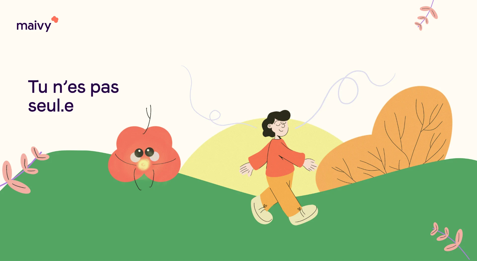
designed for the french market · interface and content in french
at a glance
- type
- Independent certification project
- product
- Mental-health app concept
- research
- Typeform · 80 participants · Dovetail · 3 interviews
- my scope
- Research · product definition · flows · UX/UI · identity · Framer
- built
- Responsive Framer landing page + blog
- not built
- The application itself
Why this problem
I came to Product Design with a background in psychology, so I used this project to revisit a question I already cared about from another angle: what happens before someone even gets to a first therapy session.
Finding help can already feel confusing. People may not know what kind of professional to look for, what different approaches mean, or how to judge whether the person they find will actually feel right for them.
What I learned from the research
To understand that first step better, I combined a broader survey with a small qualitative research phase. I wanted to see what people found confusing, what they expected from the experience, and what mattered when choosing a professional.
I ran a Typeform survey with 80 participants and three semi-structured interviews analysed in Dovetail.
80
survey participants
Typeform
3
interviews
Semi-structured · Dovetail
01 / clearer guidance
People needed clearer ways to understand where to start and what different approaches actually mean.
02 / relational fit
Feeling understood and comfortable with the professional mattered alongside speciality or method.
03 / less medical, more human
The experience needed to feel reassuring, understandable and possible to explore at one’s own pace.
04 / continuity
The concept also needed to consider what happens around and between sessions, not only the appointment itself.
a direction became clearer
Helping people understand their needs + feel more confident about who they choose became central to the concept.
Looking at existing services pointed in the same direction. Many existing services focused on booking, access or self-guided support, leaving more room to explore guidance, relational fit and continuity around the therapeutic relationship.
From research to a product concept
The research also helped me get clearer on who I was designing for. I translated what I had heard into three personas and empathy maps, then used those to map the overall user flow before deciding what the product needed to support.
I used those themes to define a broader Maivy experience. I mapped the application around the moments that seemed most important: understanding what someone needs, finding and exploring professionals, preparing for and following therapy, accessing resources, and knowing what to do in a crisis.
The application stayed a concept, but mapping it helped me make the experience concrete enough to design.
product concept · mapped, not built
- 01
Understanding needs + onboarding
Helping someone put words on what they’re looking for.
- 02
Matching + therapist search
Suggesting professionals by compatibility, not only specialty.
- 03
Exploration + educational content
Learning about approaches at your own pace.
- 04
Follow-up after sessions
Mood, notes and small tools between appointments.
- 05
Crisis path
Clear steps and help when things get heavy.
- 06
Professional space
A space designed for practitioners too.
The application stayed a concept. The landing page and blog were the part I built in Framer.
Building the identity
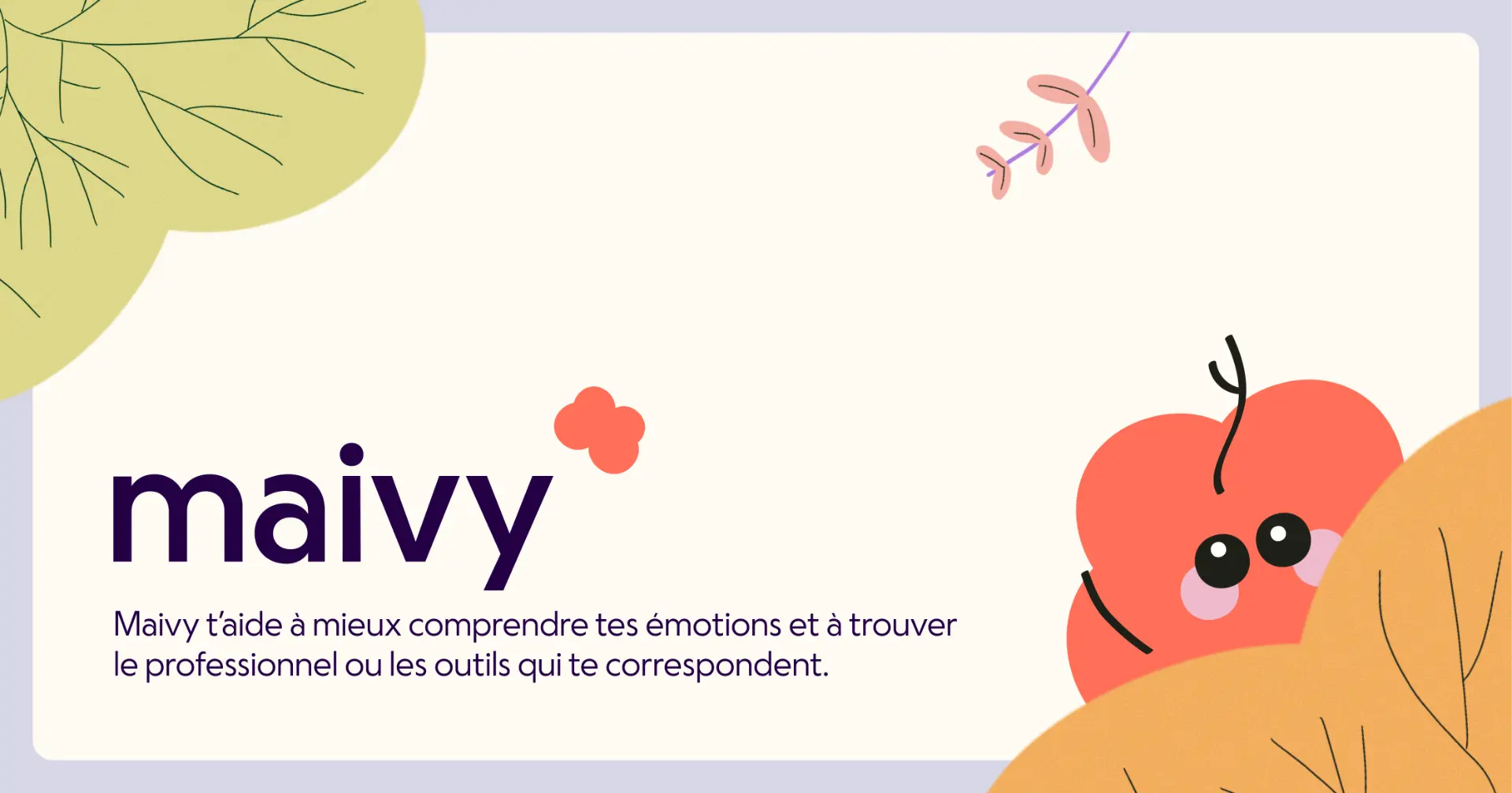
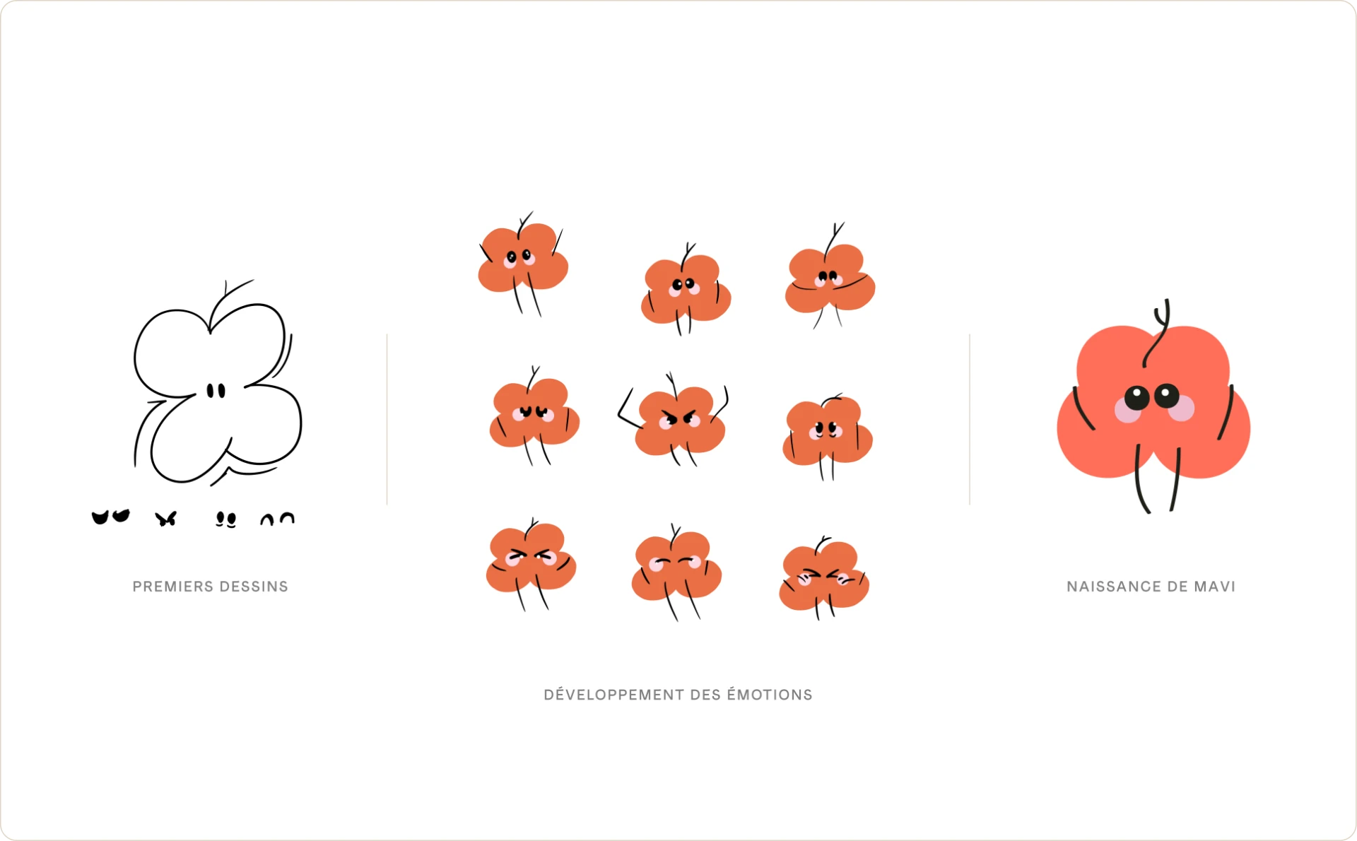
I created Maivy’s visual identity alongside the product concept. The name comes from the Latin viam, meaning “path”; read backwards, it also sounds like “ma vie”. I designed the wordmark, developed Mavi as a small organic mascot, and drew the illustrations in Procreate.
The app concept
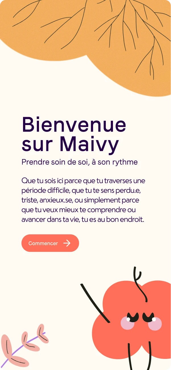
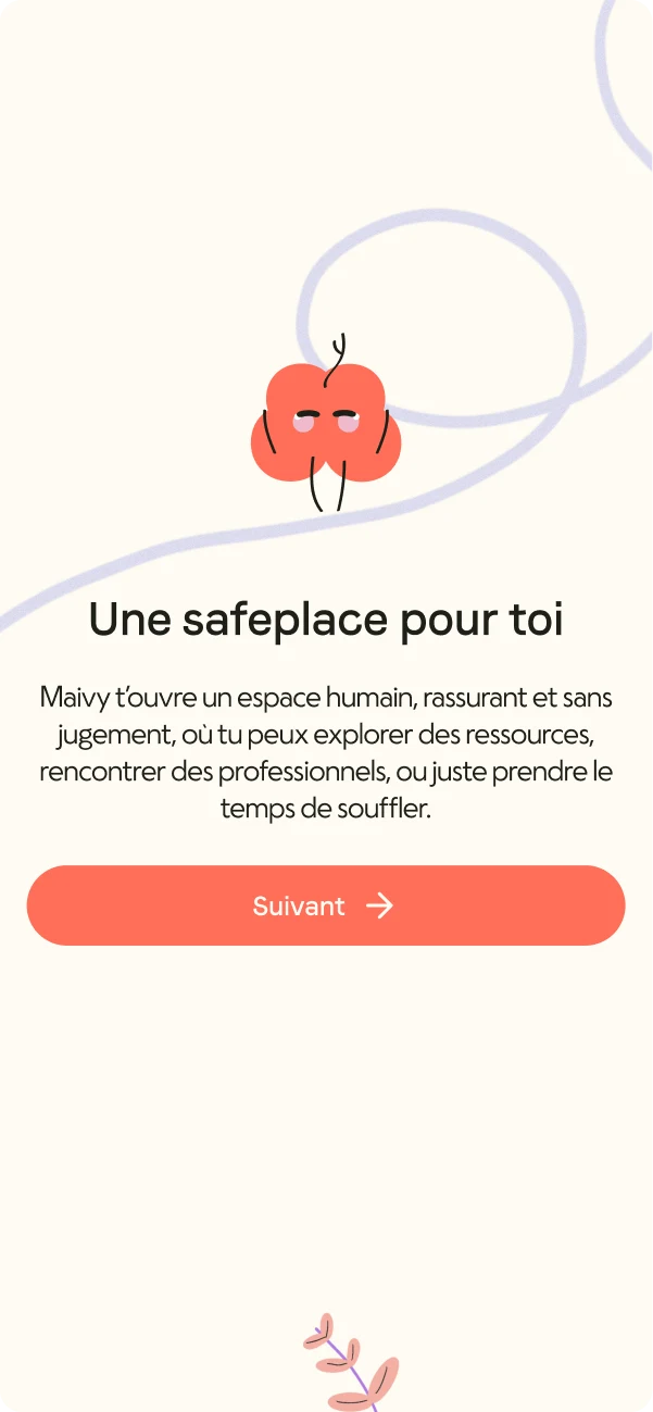
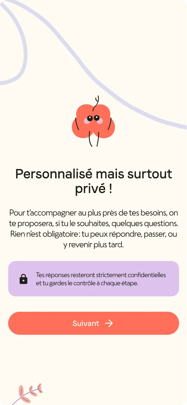
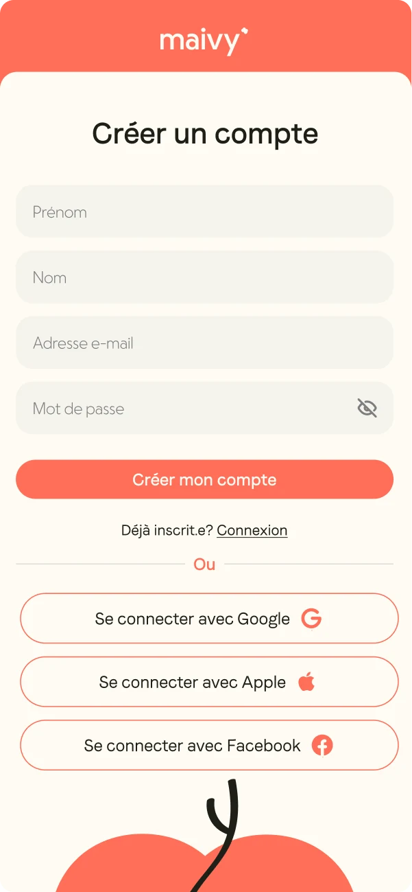
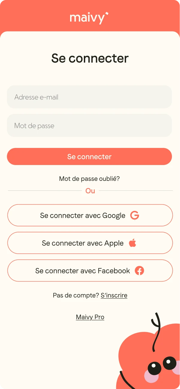
I created a set of early direction screens in Figma to explore the tone and some of the first steps of the experience. They show part of the direction I was considering, rather than a complete application design.
early direction · not a finished app design
What I actually built
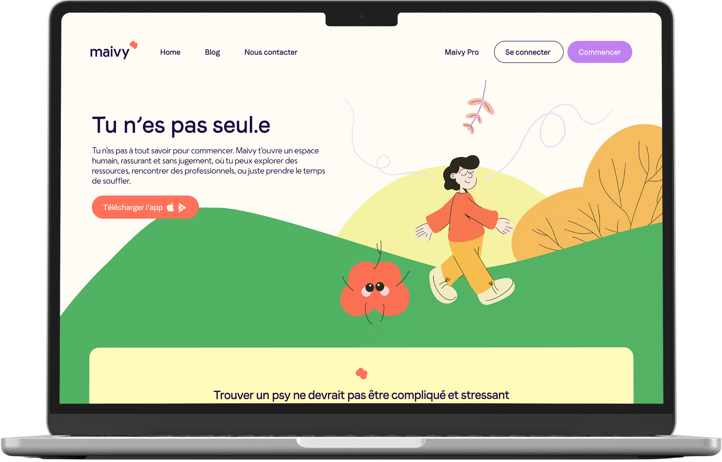
The certification required a built website, so I took the landing page and blog all the way from Figma to Framer. I built them responsively, set up the CMS, worked through SEO fundamentals, and included accessibility considerations informed by WCAG 2.2 AA. I didn’t run a full accessibility audit, so I wouldn’t call the result WCAG-compliant.
If I took Maivy further
The matching logic is the part I would push first. I’d go deeper into the questions and filters people actually need, then test whether the suggestions feel relevant and whether people understand why they are seeing them. In parallel, I’d start shaping Maivy Pro with professionals, so I could test the matching from both sides: what people are looking for, how professionals describe their practice, and whether the connection between the two actually makes sense.
I’d also want the crisis path reviewed properly with qualified professionals before taking that part any further.
Where the project stopped
Maivy remained an independent certification project. The research participants were real, the broader application stayed a concept, and the landing testimonials were illustrative. The parts I took through to a built result were the public-facing landing page and blog in Framer.