
case study · société générale / sg markets · apprenticeship · 2024–2025
Scoping and designing the first version of eFund Order
A fund-order monitoring tool for Middle Office teams. I took on the design work from early scoping through implementation follow-up. By the time I left, implementation was well advanced and an internal version of the MVP was already available for testing and review.
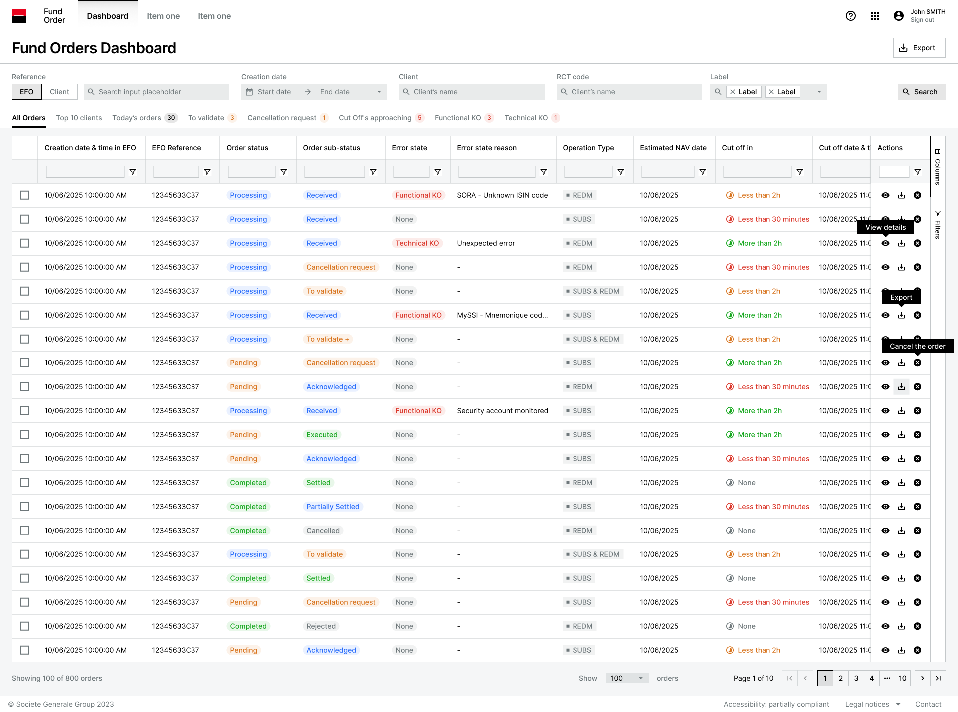
at a glance
- official role
- Product Designer · Apprenticeship
- project responsibility
- Design lead on eFund Order
- context
- SG Markets · fund-order monitoring · 0→1 MVP
- origin
- Hackathon → design sprint → full project
- team
- Business / Product / IT / Design · France & India · working in English
- my work
- User understanding · flow mapping · MVP scoping · wireframes · UI · technical feasibility · developer handoff · UI reviews
- status
- Advanced implementation · internal testing and review · UI reviews · next requests already starting
Where it started
The project came out of earlier hackathon and design-sprint work, but there was still a lot to sort out. Different people had different ideas about what the tool should do, and we could not put all of them into a first release.
My design mentor joined some of the early calls, then I took over the design work. I needed to understand how the Middle Office teams worked, map the main order flow and make the scope concrete enough for everyone to discuss the same thing.
Getting to an MVP
We chose a first version around consultation and cancellation. That meant saying no, or “later”, to part of the wish list. I worked through the flows and wireframes, shared them regularly with the team, and kept adjusting the scope as we learned more about the users and the technical constraints.
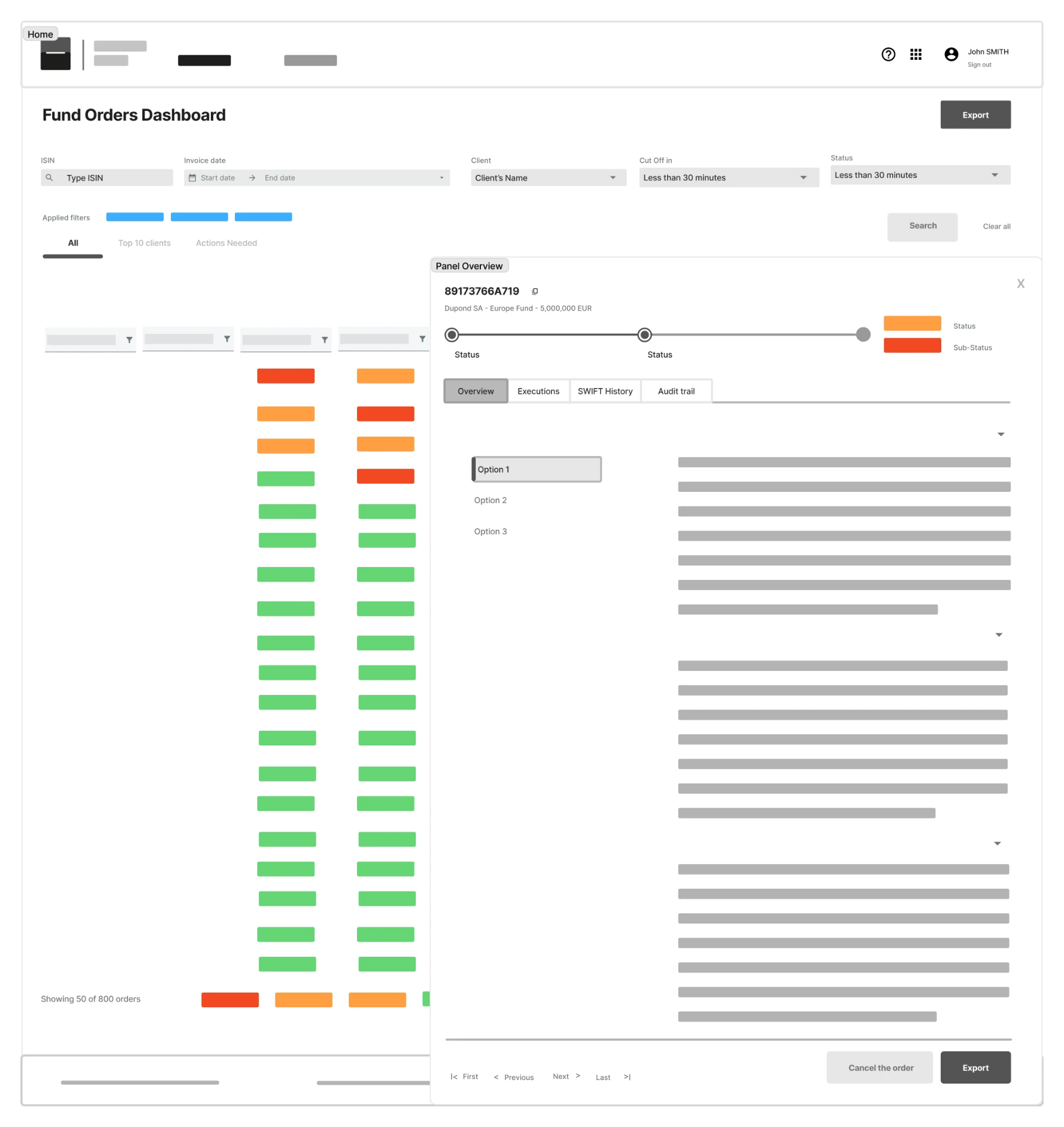
From wireframes to implementation-ready UI
Once the scope was stable enough, I moved into the SG Markets design system and designed the production screens. I worked directly with the technical teams in France and India while designing, so feasibility questions were part of the iterations rather than a final surprise.
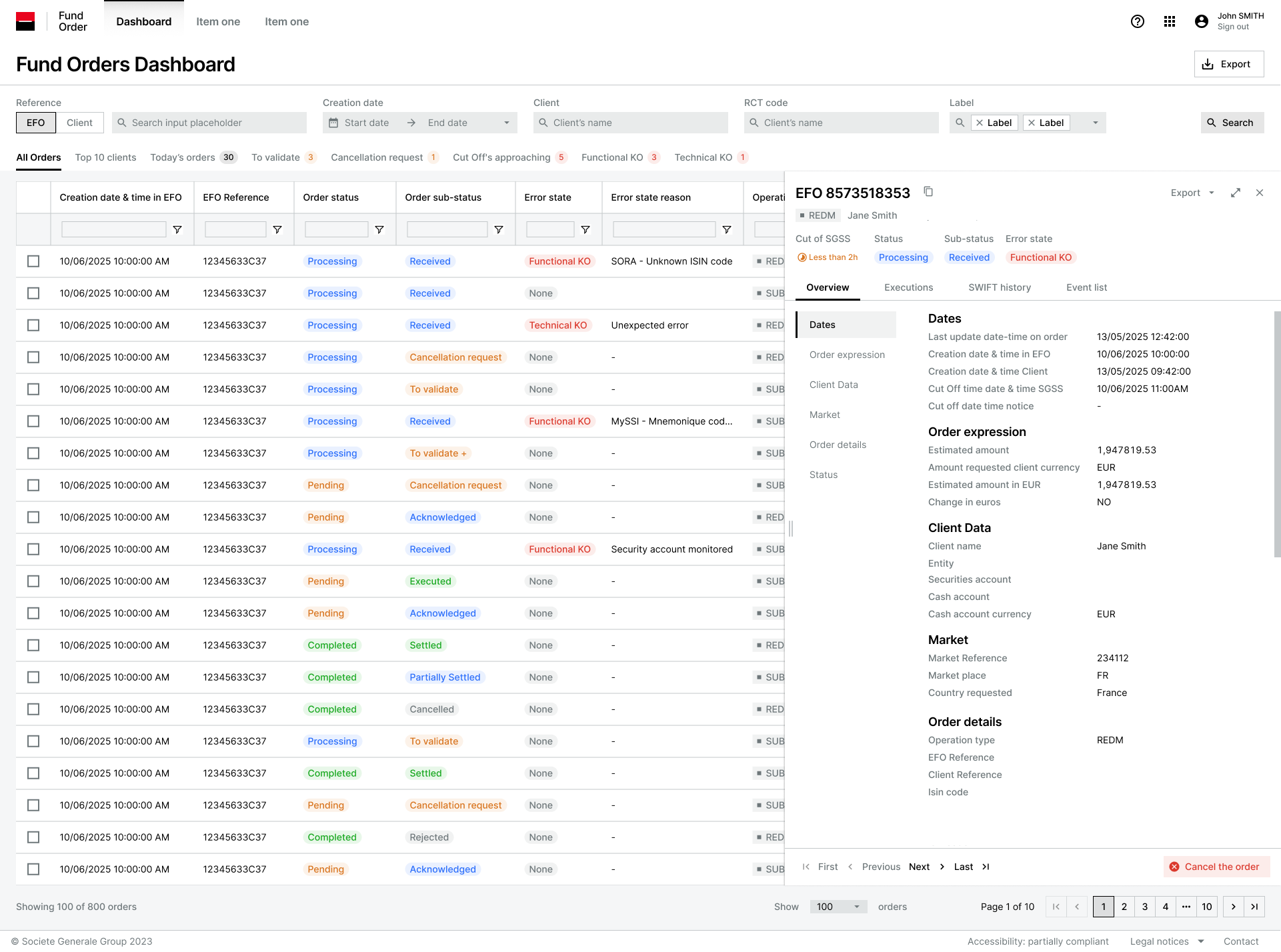
Visible in the final UI
- Quick filters with counts
- The list opens on operational segments, each showing how many orders sit inside it.
- Cut-off information shown explicitly
- Cut-off information remains visible directly in the order list.
- Status, sub-status and error kept distinct
- Three separate pieces of information, each with its own column and treatment.
- A contextual detail panel
- Selecting an order opens its detail beside the list; the list stays visible behind it.
Handoff
I prepared the developer handoff for the MVP and stayed close while the technical team implemented it. An internal version became available for testing and review, which let me continue through UI reviews rather than stopping at the Figma handoff.
By the time I left Société Générale, implementation was well advanced and the team was already moving on to the next requests. I do not have a clean before/after metric, so I stop there rather than turning that progress into an outcome I cannot verify.
Internal product. Screens use dummy data and the copy stays within the public scope I am allowed to share.